Summary
- We created two performance scores with the objective of building a policy tool to
- measure the efficiency of every borough in London dealing with fire emergencies and
- estimate the impact of change as one or more stations are closed.
- The first score is the expected attendance time (how many seconds it takes for the first pump to reach the incident) of an incident following the closure of one or more stations.
- We presumed that attendance time won’t change for those areas that are served by stations that are not going to be closed.
- For affected areas we calculated the new attendance time as the average of the attendance times of neighbouring incidents in the same borough by stations that remain open.
- The second score combines attendance time (from the first score) with the number of people potentially impacted by the incidents. We assume, given the same attendance time, that incidents are more critical for highly populated areas in London compared to sparsely populated ones.
- We visualise a borough’s performance and the two scores with an interactive map of London. The users can explore the impact of closing one or more stations of their choice.
Data
London Fire Brigade incidents records
The London Fire Brigade publishes the incident records at the “London Datastore” of the Greater London Authority. We use the data between 01/04/2007 - 31/03/2013; earlier dates are also available but not within the scope of this research.
The records document three possible kinds of incidents: fires, “special services” and false alarms. For each incident we have date, time, and the attendance time and source stations of the first and second pumps that attended the case. It is common practice for more than one stations to support the same incidents.
Telefónica Dynamic Insights mobile phone activity
The data provided by Telefónica is the network operator’s estimated projection of the number of people who were present at a specified location at a certain date and time. They infer the ‘real’ number from mobile network users, where their devices are registered at local masts. This is also commonly called ‘footfall’.
Although the data is produced by only one network operator, it accounts for all other networks as well as people who did not use mobile phones at that time. We can assume that network operators have reliable ways to infer these figures from the number of their own devices.
The data we received from Telefónica included:
- the list of the network’s ‘output areas’ serving the metropolitan area, including their location and radio coverage in sqkm
- for each of the output areas above, the estimated footfall per day and per hour for the periods of:
- 9-15 December 2012
- 20-23 December 2012
- 30 December 2012 - 6 January 2013
- 13-19 May 2013
As our objective was to create a representative ‘average week in London’ of footfall data, we selected only two of those four time windows: 9-15 December and 13-19 May. We omitted the weeks including Christmas and New Year’s Day because they are unsuitable to represent an average week in London.
The data sets were harmonised before merging for the following reasons:
- the sets used different formats for some of the data, e.g. date and time of footfall,
- there were gaps in the footfall caused by one or more stations being occasionally out of service because of maintenance or faults (the nearest output areas whose data is complete was used as reference instead in those cases), and
- we found duplicate rows and removed them.
We aggregated the data by weekday by averaging the respective footfall values from both sources.
We also used other sources to visualise the data, e.g. the Office for National Statistics’ key statistics for London as of August 2012, available here.
Process
All the software supporting the process described below is available on the GitHub repository at [https://github.com/theodi/FNR_Analysis](https://github.com/theodi/FNR_Analysis).
Our work can be divided in two stages: (1) pre-processing the data and (2) the actual visualisation of the results using an interactive map. The objective of the first stage is to consolidate the data and pre-calculate as much as possible of the results for use in the second stage.
Pre-processing
Together with the data harmonisation described above, several steps were necessary to take us from the raw data to the interactive map. The diagram below describes the workflow for all required needed operations.
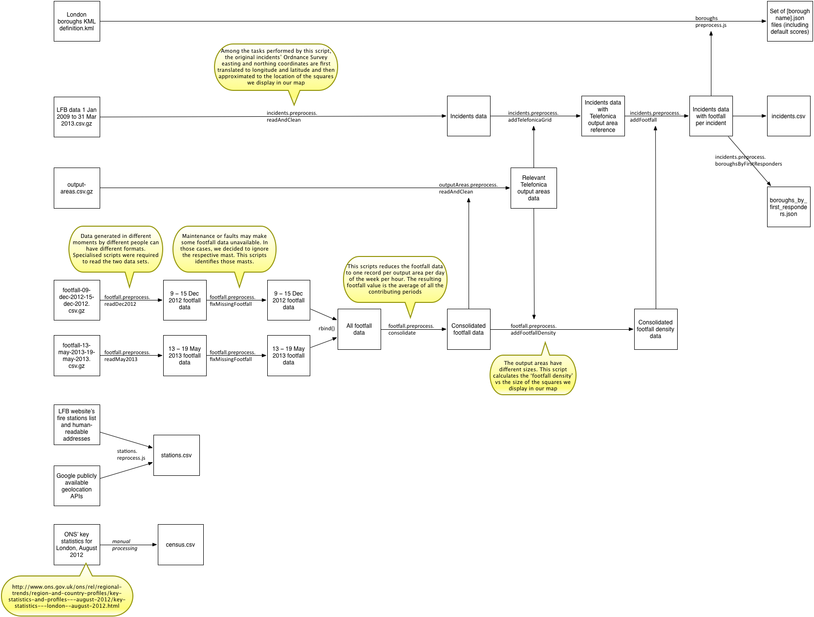
All of the code referenced in the diagram is available in the GitHub repository in the raw and preprocessed directories, but for the Telefónica data.
Visualisation
The map starts from the pre-processed data described above and just displays it according to the user selection. Minimum calculation takes place at this stage.
Scoring
Combining attendance time with footfall data requires an implicit judgement of how many seconds you are willing to trade off to reduce an incident’s exposure to people.
For example, we consider an incident that was served in 4 minutes and concerned 100 people to be roughly comparable to an incident that took 5 minutes but only concerned 10 people. Note that this relationship is not linear. More examples are in the table below.
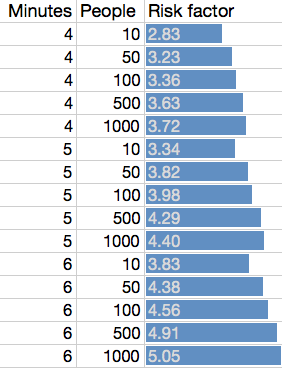
We have tried and tested various functions and found that a Cobb–Douglas type utility function allows for the most elegant specification. It has various desirable properties. We calculate the “risk factor” (lower is better) as shown below, where attendance time is in minutes and footfall is the log10 of footfall, the estimated number of people.
risk factor = attendance timeα * footfall(1 - α)
The parameter α specifies the relative weight for attendance time and footfall and is set, after consultation with the team, at 0.75. An α of 0 would only use footfall (and be nonsensical), whereas an α of 1 only takes into account attendance time.
Solution architecture
The map has two components: what the user actually sees in the web browser and an API server.
API server
The API server exposes the minimum set of computational functionality that the client requires to avoid downloading the data locally. The /getBoroughResponseTime API, for example, estimates the average response time in a borough after closing none or a few stations (e.g. /getBoroughResponseTime?borough=Westminster&close=Southwark&close=Westminster ).
The server component is made necessary to reduce the footprint of the web client application, as it is not always convenient to download the entire >100Mb uncompressed dataset to the client on slow connections. This is particularly necessary when not running the tool locally.
The server is written in Node.js (an open source JavaScript extension and interpreter) and iis currently hosted on a virtual machine offered by our partner Rackspace.
Web browser-based interactive map
The web browser-based interactive map is designed to be used stand-alone or embedded in third parties’ websites.
The map services are provided by Open Street Map.
Among the other componets being used, the map’s code is built on top of two mainstream open source data visualisation libraries: “Leaflet” (http://leafletjs.com/) and “D3” (http://d3js.org/). The “Interactive Choropleth Map” from the Leaflet documentation in particular was of inspiration for the final tool (link). All client-side code is written in JavaScript and expected to be compatible with most modern mainstream web browsers.